致力于航空、生产制造、零售等多行业产品方案与服务
- 🎓 文科背景、法学学士|教育学硕士
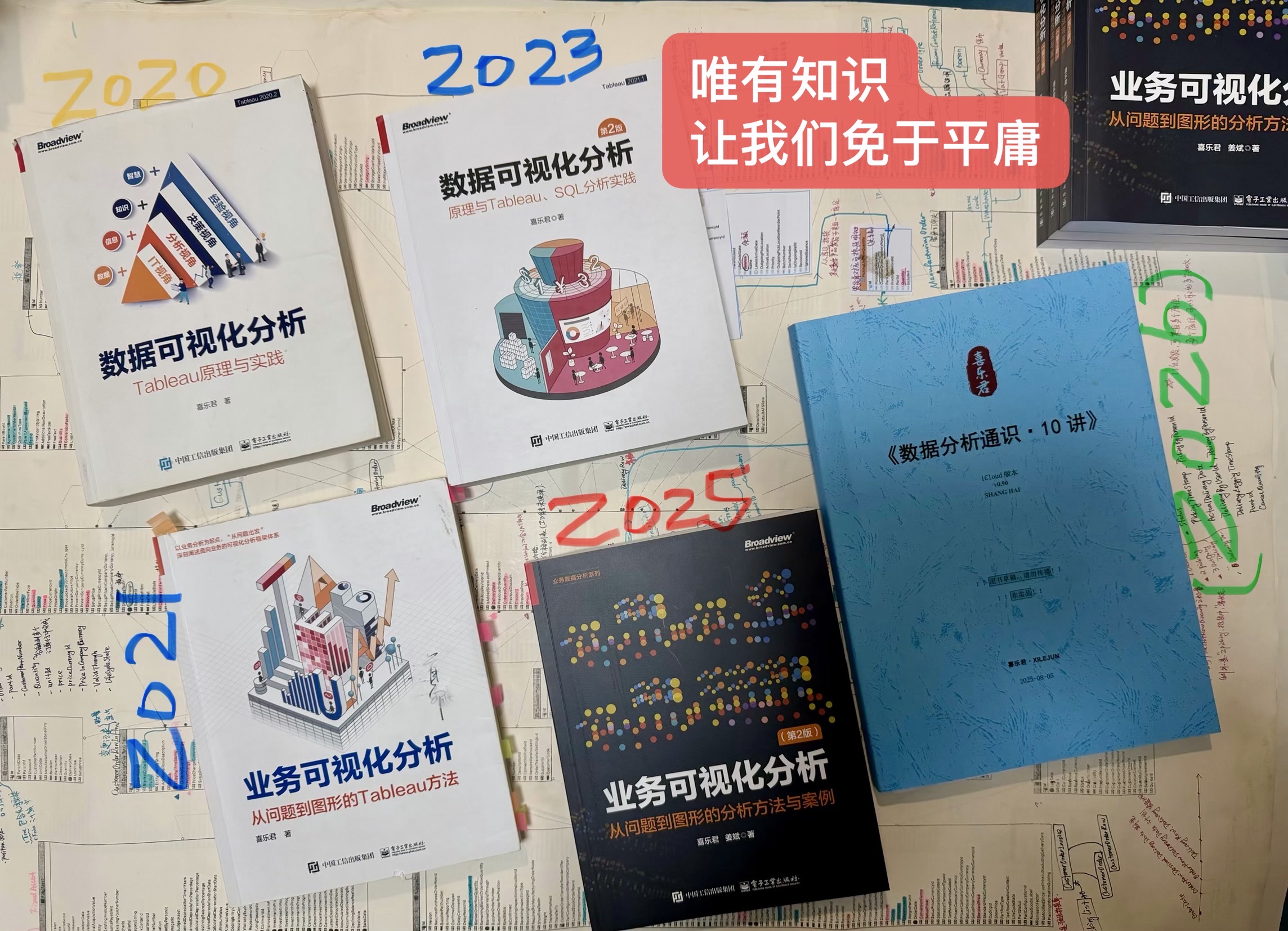
- 📊 业务数据分析「专家」· 敏捷 BI 布道师
- 📚 《数据可视化分析》《业务可视化分析》图书作者
- 🎓 中国地质大学(武汉)经管学院 MBA 校外导师
- 🤝 以 Tableau 会友,致力于构建业务分析通识框架
📚 本文配套课程 · 数据可视化分析系列
🎬 B 站课程:数据可视化分析:Tableau/SQL 原理与实践 — https://www.bilibili.com/cheese/play/ss8093
Prior to the introduction of agile BI solutions, analytical results were often presented as a cross table. Figure 3-3-1 depicts an Excel cross table with nesting rows and columns, as well as totals.
Figure 3-3-1 Pivot Table in Excel
Nowadays, the explosion of data has accelerated the development of visual charts even though cross tables is still a significant type of presentation.As seen in Figure 3-3-2, both cross tables and bar charts can be used to depict “profit and sales of each category and each subcategory”, but they are clearly different.
Figure 3-3-2 Aggregate Tables Can Be Presented in Different Ways
From the perspective of business analysis, crosstab and visualization share the same problem structure and aggregation process. Analytical nature is unchanged by visual portrayal.
However, each of the two modalities has advantages and disadvantages when it comes to the efficiency of information transfer. Because cross tables have a greater information density, analysts can obtain precise values from them. Visual graphics, on the other hand, can highlight important information. In the case introduced in Figure 3-3-2, analysts may rapidly identify “subcategories with large profit losses” by visual marks like length and color, which drives further investigation of operational issues.
Therefore,this section will introduce the basic logic behind visualization,such as how to choose suitable tables and charts for visualization, how to extend visualization by adding marks or analysis, and how the fileds will change the charts. For more graphs, you can wait to see contents in Chapter 5.
Therefore, this article will outline the fundamental principles of visualization, including how to select among tables and charts, how to optimize your visualization, and how fields can affect visualization. The specific methods to draw charts will be introduced in detail in Chapter 5.
1 、Problem Type and Visualization
For a given problem, the best chart is mainly determined by the relationship between the dimension and the measure.As shown in Figure 3-3-3, seven main types of charts are introduced in combination with their corresponding business problems. This is the backbone of visualization.
Figure 3-3-3 Business Problems with their corresponding optimal charts
Compared with cross tables, visualization provides more flexible expression space. Analyst’s business background, tool selection, color preference, expression medium, etc. will all affect its display. Therefore, we should make full use of this advantage, and flourish our “visualization tree” by adding more branches and leaves based on the trunk. In Tableau, the main view can be optimized by editing markers (color, size, shape, etc.), coordinate axes, reference lines and trend lines, as is illustrated in Figure 3-3-4.
Figure 3-3-4 The Process of Building Visualization
2、Fields Classification Behind Visualization: Continuous and Discrete
Fields are the basic components of problems,tables and visualization. In Article 3.1 and 3.2 ,We have introduced two fields classifications:
1)Demension&Measure: We divide fields into dimensions and measures from the perspective of business problems. This classification helps us to interpret the problem and conduct our analysis.
2) Data Type: Data type reflects the kind of information stored in that field. This classification usually come from the original data source.The main types of data are “intergers” and “numbers”, and we can also divide them into more detail types.
In Tableau, we also have a crucial field property, which determines the construction of charts, that is, continuous and discrete.
Values in discrete fields are independent to each other, and have no default order in business context. In contrast, values in continuous fields,usually number and date, have a default order. Following are a few examples.
- Discrete: East China, North China , Northeast China
- Continuous date: 13/03/2022,14/03/202, 15/03/202
- Continuous number: 3.14, 4.2, 5.6
2.1 、The Classification Basis of Continuous and Discrete Field
The continuous or discrete property is typically determined at the data source stage (static),and can be changed at the analysis stage (dynamic).
In most cases,the continuous or discrete property is determined once the data type of the field has been established. Take MySQL as an example. “String” type data like [Company Name], [Customer Name], [Order ID], etc. are discrete fields, and “date”, “datetime”, “int”, and “float” data are all continuous.
However, there are still some unusual sorts of data,such as”numeric string” and “string date”. Their default classification might be inaccurate. When dealing with this kind of data, we should examine and adjust its data type in the data source and change the continuous/discrete property in visualization. For example, some data sources utilize “1” to represent “male,” “0” to represent “female,” and “2” to represent “other” in the [Gender] field. In this instance, its data type will be automatically identified as “numbers” , and Tableau will classify it to continuous field accordingly. This classification contradicts the field’s actual business meaning,so we should change the data type to “string” and convert the field to discrete then.
In visualization, continuous fields and discrete fields are displayed differently.Discrete fields act as labels whereas continuous fields draw axes. The coordinate axis extends infinitely from the origin to both sides.In Tableau, a typical numeric coordinate axis is centered on 0, while the origin of the date coordinate axis is January 1, 1900, as illustrated in Figure 3-3-5.
Figure 3-3-5 Origin of Coordinate Axis
As mentioned before, whether the field is continuous or discrete is determined by its data type. This rule applies not only to “detail table”. After aggregation, discrete or continuous property is also determined by the aggregated fields’ data type. For example, when the discrete [Order ID] field is aggregated into [distinct count of Orders], it turns from discrete to continuous, and draws axes in the view, as shown in Figure 3-3-6.
Figure 3-3-6 Continuous/Discrete Property Is Initially Determined by Fields’ Data Type
2.2 、Convert Fields between Discrete and Continuous
The field in Tableau is green when it is continuous and blue when it is discrete. Analysts can change the default property of fields in the Data Pane or View.
For example,the [order date] field is discrete by default, as illustrated on the left side of Figure 3-3-7. We generate labels for different years by adding[order date] to the view. If we right-click [order date] in the Data Pane and choose “Convert to Continuous” from the pop-up menu, a date coordinate axis could be generated as shown on the right side of Figure 3-3-7. Remember: Tableu considers the coordinate axis as a whole. Analysts cannot select a single date or a single number.
Figure 3-3-7 Convert Discrete Field to Continuous
Converting field’s discrete/continuous property from the Data Pane is valid for the entire workbook. If analysts only want the alteration to be valid for a specific worksheet, we can convert the property from the view. In practice, we usually keep both the continuous and discrete fields in the same view to combine the precision of the crosstab with the visual benefits of charts.
As shown in Figure 3-3-8, in addition to the “continuous” [number of order], the “discrete” [number of order] is added to the view. The value and bar graph complement each other, allowing users not only to focus on the comparison among categories, but also to obtain accurate values quickly.
Figure 3-3-8 Retain Discrete and Continuous Field in the Same View
In Tableau, there are at least 4 methods to realize discrete / continuous conversion, which are summarized as follows.
- Data Pane: Right click the field and select “Convert to Discrete/Continuous” in the pop-up menu. This setting is valid for the entire workbook.
- View: Right click the field on the row or column of the view and select the “Discrete/Continuous” command in the pop-up menu. This setting is only valid for the current field of the current worksheet.
- Bins: Right click the field in the Data Pane, and choose “create bins”. This method divides continuous fields into discrete intervals.This is the basis of histogram (Chapter 5, Section 5.2.3)
- Logical Calculation: Create a calculation field and write an IF expression to divide continuous field into user-defined groups. For example, “IF [profit] > 1000 Then ‘ high profit’ ELSEIF [profit] > 0 THEN ‘low profit’ ELSE ‘loss’”. This method is commonly seen in advanced analysis.
2.3 、Influence of Continuous and Discrete property on Visualization
Since discrete/continuous fields generate labels and axes respectively, the nature of discrete or continuous determines the ideal graph corresponding to business problems and vice versa.
Take sorting problem as an example. The problem should have a discrete field (because only discrete field can be sorted) and a continuous field, which acts as the sorting basis. In the problem “Order quantity of each customer”, for example, the [Customer] field is discrete and will be sorted, whereas [Order quantity], a continuous field, controls how [Customer] is sorted. Similarly, the problem “sales of each month” corresponds to the line chart because the dates are continuous by default and can create axis. Line charts are inherently connected with axis.
The continuous and discrete property of fields can also affect visual elements such as color and size. It is worth mentioning that color is the most essential visual element, second only to position, and hence is especially crucial.
Taking color as an example,Figure 3-3-9 shows the influence of continuous and discrete properties of fields on views. The graph on the left uses discrete [sub category] fields as color markers. Discrete fields are represented by independent color phases by default. Too many colors add the visual burden.In contrast, the color of the graph on the right is marked with a continuous [Sales] field. The continuous fields are displayed in gradient colors by default. Color saturation steadily diminishes with decreasing percentage, giving readers a more intuitive impression.
Figure 3-3-9 The Influence of Discrete/Continuous Property to Color
3、 Summary of Three Classifications of Fields
Article 3-1, 3-2 and 3-3 introduce three different classification of fields, which are briefly summarized below:
- Dimension and measure: this classification is from the perspective of business problems and is subjective and flexible. Dimension represents the unit of analysis, measure represents the result of analysis. Dimension is the aggregation basis of measure.
- String and number: this classification is from the perspective of the data. It is objective and will not change with analysis. “String” represents classification and does not support arithmetic operations. “Number” supports arithmetic operations.
- Discrete and continuous: this classification is from the perspective of visualization. It is subjective and flexible. Discrete fields generate labels, and continuous fields establish coordinate axes. The axes are important for creating view space.
The three classifications do not have an inevitable corresponding relationship. For example, the data type of [age] field is usually ” number”, but in analysis it can be both a dimension and a measure; The data type of [order date] field is “string” (“Date” is a special “string”), but can be a discrete or a continuous field.
Figure 3-3-10 three classification of fileds
Tableau’s product design also fully reflects the elements of visualization, as can be seen from Figure 3-3-10:
- Tableau uses different areas to represent dimension and measure fields. Dimension fields are placed in the upper part and measure fields are placed in the lower part .Aggregate measures that are meaningful only at the problem level (such as SUM ([Profit])/SUM ([Sales])) also appear in the measure area.[Before Tableau 2020.2,the Desktop had clear words “dimension” and “measure”, which were distinguished by the middle split line. When dragging fields, the words “dimension” and “measure” would appear on the top and bottom of the line respectively. Tableau 2020.2~Tableau 2020.4 are slightly different.]
- Tableau uses color to represent discrete and continuous fields. Blue represents discrete, and green represents continuous.
- Tableau uses shapes to represent data types, functions and attributes of fields (including sets, groups, hierarchies, data buckets and other functions, which will be introduced in Chapter 5), where dates, booleans, strings are collectively referred to as “strings”, while integers and decimals are collectively referred to as “numbers”.
With the deepening of analysis, Chapter 8 will introduce another important classification from the perspective of calculation: business field and analysis field.
The classification of fields may be abstract, but understanding these abstract concepts will help analysts improve their analysis. In fact, analysis is a process of abstract thinking. The more abstract your analysis is, the more insightful it will be. Similarly, the greater abstract capability the tool has, the higher upper limit your analysis can reach.